My original test was 'OK' and I have to say GoPro made a pretty good job of it's basic output settings for the 'casual' user who doesn't want any more fuss than pressing the record button. And, after all, that is a big part of the attraction and market for the GoPro - not everyone is a budding Spielberg!
 |
| A sample screen-grab from my first test movie displaying the slightly saturated colours inherent of the GoPro's default setting. Acceptable, but a little too warm for me. |
My cunning plan was to try and get a fairly 'flat' colour rendering so that I could retain as much detail as I could in the shadow and highlight areas of my footage. This is so I can them experiment with LUT colour profiles and add a 'cinematic' (fanciful) colour look later in post.
Note: It is my opinion that although there is a lot talked about LUTs - and many videographers declare their use a 'science' - this technique of modifying colouration of footage is actually more of an art and is down to the personal taste of the editor. In other words, it's a stylistic 'look' and not any real attempt to recreate a realistic rendition of the original colour scene. NOT that there is anything wrong in that!
So, in my latest sound test of my GoPro I took the opportunity to fiddle with some of the setting - after some research into what they do and how they effect the output - thereby killing two birds with one stone. My modifications of the default settings were as follows:
- (Most important) PROTUNES turned ON.
- WHITE BALANCE: Set to 6500 (as it was a little grey and cloudy on the day).
- COLOUR TUNING: Set to FLAT.
- ISO Limit: Set to 400.
- SHARPNESS: Set to MEDIUM.
- EXPOSURE COMPENSATION: Set to '0'.
A full explanation of these settings and their purpose can be found at these two links:
• Understanding Video in the HERO4
• Advanced Protune Controls Explained
Here's a screenshot taken from this latest test video giving you an idea of how these settings changed the colour and exposure reproduction from those of the GoPro's defaults...

As you can see, the scene looks a little 'washed out', there are no extremes of contrast - so the blacks aren't quite black and the white (highlights) are only pure white in the very brightest areas. In other words, I have retained as much detail as I can across the spectrum (is that the right term?) so that I do not lose any detail once I start fiddling with colour interpretation later in post.
Does that make sense? (I did the same 'flat' profile technique in my experiments with my Fuji XT-2 camera.)
Putting back the Colour in Post
I guess you could say that the whole process - of creating a flat profile - is one of initial deconstruction prior to renovation...?
The point being that, my filming being more impressionistic that documentary I want to say something very personal about 'the day' and how the scene appeared to me. So my film is a tad subjective and may not tally with another person's view of the day, even if they were actually with me!
SO...Now the most interesting part, my interpretation of the day by means of the application of colour and exposure balance adjustments in my video editing software (Cyberlink Power Director 17). And here's the result...
The colour adjustments done in the above video were as follows (corresponding the the scene's number in the top right corner):
Scene 1: Applied PowerDirector 17 'Preset' colour profile - 'Blue Ocean'.
Scene 2: Modified colour adjustment settings in PowerDirector...
- Vibrancy: +18
- Contrast: +6
- Brightness: +3
Scene 3: Applied LUT - 'Contrast', plus the following colour adjustments...
- Vibrancy: +18
- Contrast: +18
- Sharpness: +38
Scene 4: Modified colour adjustment settings in PowerDirector...
- Brightness: +8
- Contrast: + 11
- Saturation: 86
- Vibrancy: +2
- Highlight Healing: 42
- Sharpness: +27
Scene 5: Applied LUT - 'Matte'
Scene 6: Applied PowerDirector 17 'Preset' colour profile - 'Harvest Farm'.
Scene 7: Modified colour adjustment settings in PowerDirector...
- Brightness: +12
- Contrast: +26
- Saturation: 123
- Highlight Healing: 82
- Sharpness: +11
What was my Goal?
Ok, before I talk about which 'profile' I preferred I should begin by outlining just what I was trying to achieve. I actually had a 'plan' before I even started filming and that was; because it was a bit of an overcast and intermittently dull day I wanted to make the end product look a little more summery and 'warm' than it actually was on the day.
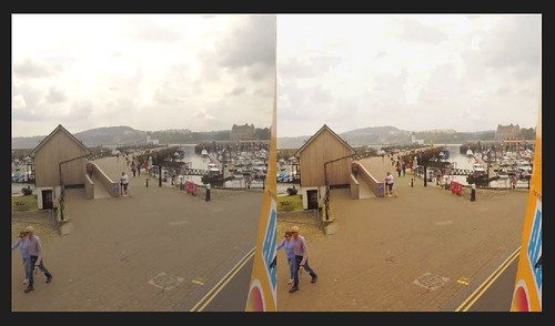 |
| Power Director 17 has a nifty split-screen feature so you can see your modification as you do them. Here you see - on the left - the raw GoPro footage, and - on the right - some colour adjustments. |
So, project goals: To brighten up the overall exposure and 'warm' up the colours while still retaining a fairly honest rendition of the details (such as the clouds)...
For this reason, I think that I preferred the profile adjustments done to Scene 5 BUT I might have increased the sharpness. That's just my personal preference for this particular project on this occasion. On a different day, and were I in a different mood, I might have felt like applying a different look.

(Scene 1 is probably closer to a 'realistic' rendition of the day but with the blues in the sky intensified.)
A Further Complication...
All this 'arty-farty' messing about is OK, but what if you do want a documentary-style rendition of the day OR want to colour match the GoPro's footage with that taken by another camera...You can't go messing about aimlessly, you do - then - have to apply a bit of 'science'.
Again, though, producing a 'flat' colour profile might be your best option as a base starting point. That way you have more detail to work with as you try to match up colour, exposure, contrast and sharpness with your target footage.
In combination with other production tools - such as a white balance or colour checker card to establish a base line in your footage and the colour-picker and colour-match tools in your software - you should be able to produce something approaching a faithful reproduction of the subject (ish).
(I won't dwell on this differing but related issue at this point as it deserves it's own post.)
Conclusion...
Well, I've droned on long enough about what I feel is a pretty subjective subject anyway. I repeat, it's my opinion that colour correction/grading can be more of an art than a science - unless you are trying to achieve a faithful documentary rendition.
At the end of the day, as long as YOU (or your client) is happy with the colour grading then who's to say that it's not 'right'? :)
No comments:
Post a Comment